Thursday, May 29, 2008

Proportion 101- thanks to AsylumArt......

This is a great way to establish realistic facial proportions, if thats what you want of course! Some like to whack out the proportions and excentuate features etc, however, you need to start somewhere right? I reakon you need to know the rules in order to bend them.... if rules really exist that is (thats another blog somewhere)....


Thanks AsylumArts!!!

Loosen up..... Get gestural!

I discovered this today- and thought- WOW this is such a great way to loosen up, get the arms moving:


This one here is much more refined..... amazing to watch, but jeez this man is skilled huh:

Tuesday, May 27, 2008

Todays favourite thing.....

I love surfing the web, I am a self confessed nerd, whatever that means nowadays. For me- a really satisfying 'surf' is when you go on a mystery journey and end up discovering something really inspiring, or visually enticing, or ultra unique.... I especially like it when its kiwi!! (I am such a patriot haha!)
In my webby travels a wee while back I discovered this site and this site, where people sell their crafty creations, and artistic endeavours. They post internationally too! What I really like about these sites is seeing all the bizaar, kwirky and artistic things people are making.

However- Todays FAVOURITE website is: Cleverbastards.co.nz
Check it out!!!!

Monday, May 26, 2008

Book Art......
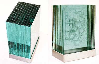

'Abyssal Plane'- Kat Greager


Books- Art or Craft, both?? A big question. Above is one in a series of pieces in which I explored the concepts of the book as symbol and culture.

The book is a fantastic format to play with. Symbolically, and physically. The possibilities are endless. Check out this website for a glimpse at some artists who have pushed some boundaries. Anselm Kiefer (see some previous posts), did a series of lead books- push those materials beyond the obvious, and conventional. Mix them up, get stuck in!! This is just a taster.
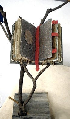


'This Alters Things...' Darrel Ross

These books that are part of a installation of an altar, illuminaria and three cast paper, handmade paper wall icons. The books represent the codex of the diety that is shown. They are all handmade pulled sheets made of grasses, leaves, recycled paper, other natural fibers, with writing and small hand casted medalions. They each rest in a found branch that holds them in a natural cradle.

Wednesday, May 14, 2008

DOF.... Depth of Field

Photo by Kat Greager
You know those photos that are only in focus in one little bit, or seem to dissapear into the distance, they have what is called a shallow Depth of Field or DOF. Its useful to consider depth of field when structuring your composition, whether you're painting, drawing or in photography. It can add impact and 'depth' (hense the name!), and zowie up your pic 10 fold. Often used in photographing food, textures in artworks, and in portraiture to really focus in on the subject, and to limit background clutter. The photo below demonstrates how limiting the focus in the background excentuates the focus on the foreground.

Photo by Kat Greager

In a 'Nut Shell' explaination, photog 101 ala Kat:
To achieve shallow DOF, you need to set your exposure with a small F stop number.... this may sound like very basic lingo, but it's the easiest way I find to remember...

smaller F stop number = shallower DOF.

Smaller F stop number means that the iris is opening up wider and letting in more light, so the faster the shutter speed..... which is good when you need to avoid camera shake (something to look out for when the shutter speed is below 1/60 you must use a tripod).
Have a play with it.... move around the subject, get on angles, this enhances the effect.

Tuesday, May 13, 2008

Texture in Paint!!!! We love it....
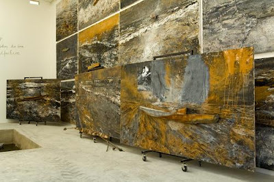

Marion Taylor, Study for idiom series
III 51 × 51 cm Oil and graphite on canvas

Anselm Kiefer, "Voyage au bout de la nuit"

vue de tableaux en préparation pour la maison Atelier d'Anselm Kiefer à Barjac, Monumenta 2007.© Ministère de la Culture et de la Communication. Photo Marc Domage.

Something that really gets me going is texture and materials. Layers and layers of it. Scratching through it, breaking it up, and reapplying it, rubbing away and repairing, pasting together and ripping apart. The materials become the voice... the direction, the next step. Loose and relaxed, freedom to move around, and not being afraid to 'make a mistake' or 'go too far'. Personally.
Above are examples of 2 artists who explore materials in a very tactile way.
Anselm Kiefer is a genius. Well I think so. There are heaps of documentaries and footage here, if you'd like to know more about Anselm Kiefer, I highly reccomend it...(Watch him draw)

Wednesday, May 7, 2008

Equine Photography.....
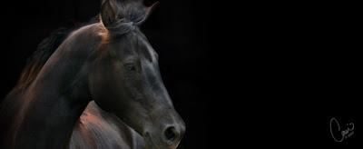


Photo by Casi Lark

This is inspired by one of my students. These beautiful animals are so stunning. Above and below are 2 examples of many, that capture their mystique, form and real beauty. All the elements fit together to create a well balanced composition.

It's important to think about how natural light is going to affect your photo. Where the light is coming from, how it will fall accross the form. Also whether you are after a soft look, or a high contrast vivid look. Obviously the type of lighting is vital to achieve the look you are after. Early morning sunrise light has some nice natural tones, and is generally soft. Some of the most amazing light effects occur first thing. Mid day sun is a lot stronger, and the sky is extremely bright, this will have a very different effect. Check out Pixalot aswell. She has some alternative angles and fantastic vivid colours going on.

Tuesday, May 6, 2008

Transferrable Creativity- NZ Music- A Thriving Creative Community...


You may have heard the term 'Transferable Creativity' being thrown around lately? Its an odd concept in a way as some assume creativity is only associated with 'art', and perhaps 'craft'. Creativity is the base ingredient for nearly everything... In this case, I guess some would put 'music' into the 'arts' genre, however, why do we need to box things? Lets take a moment to look at those musicians who arent in the commercial mainstream, quietly (actually probably quite loudly) working away in their home studios, connecting with like minded people, with similar passions, keeping it all alive. There is an amazing online community out there where these guys share music, and collborate on mixes, give each other feedback etc. This is just one aspect of 'creativity' being explored and shared in different ways.

Artists sometimes have a tendancy to be secretive and overprotective of their work, ironically, musicians share it, and allow it to grow, evolve and change. The results are an ever evolving fast growing 'scene'. dunedin drum n bass , Bassinvader , double_negative , Bassdrop , Niceup Wellington (Reggae, Roots, Dub, Dancehall) ,and many many more. There are heaps of small record companies starting up, and some that have been running for years.... This is creativity on many many levels, not just the production process of the music, but the visual extravaganza that goes with it, the image, the website, the graphics, presenting it to an audience etc etc etc.

Monday, May 5, 2008

HDR Photos- aka High Dynamic Range
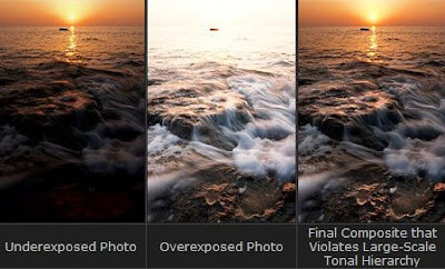

This photo is from Ryan McGinnis' blog- worth a look.

HDR- By exposing for the highlights, the lowlights and the shadows, you can then merge the 3 or more photos to create 1 photo. The idea is to allow as much information as possible to be seen in the shadows and the highlights. The effect is visually quite stunning.
You'll need a tripod (the more solid the better, nothing worse than camera shake WITH a tripod), a digital camera with manual exposure function, and some software to assist in the merging process. I recommend Adobe Photoshop CS3. It has built in HDR elements, and you can control just about every aspect of your image throughout the process. Lets face it, its what Adobe does best right, and anyone interested in digital photography should own it. For you kiwi students check out a really cheap deal at 'elive.co.nz'.